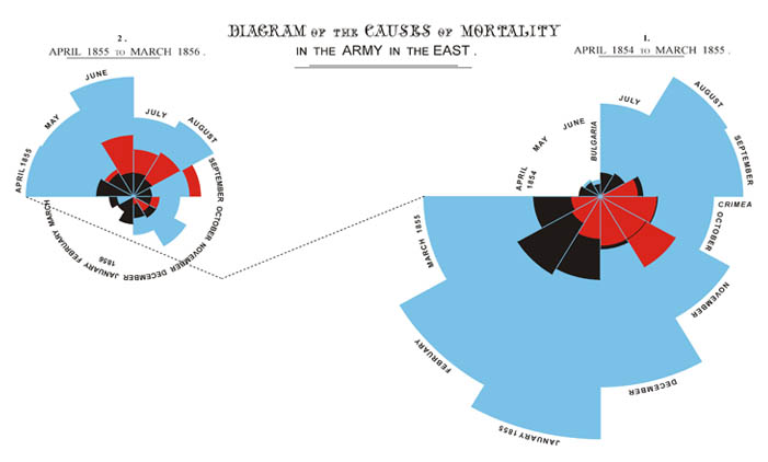
The diagram is a reproduced image from British author Hugh Small of Florence Nightingale's famous coxcomb graph, a forerunner of modern day pie charts. The polar area graph shows the mortality data from the Crimean War. The blue wedges show the deaths from preventable diseases; the red wedges show death from war wounds and the black wedges show deaths from all other causes.
The circle is divided into twelve equal "slices" representing each month of the year. Months with more deaths are shown with longer wedges, so that the area of each wedge represents the number of deaths in that month from wounds, disease or other causes. In the second year of the war (shown in the left image), deaths from disease were greatly reduced, showing the effect of the Sanitary Commission that improved hygiene in the camps and hospitals starting in March 1855. Nightingale intended to convey with the graph that the Sanitary Commission was very effective, according to Small, who has written books about both Nightingale and the Crimean War.
-Cynthia L. Webb