Hispanics are living longer than other racial and ethnic groups in the United States, according to a new report from the Centers for Disease Control and Prevention.
And these findings hold true for life expectancy at birth as well as life expectancy at age 65, two of the 20 key national health indicators identified by the Institute of Medicine at the National Academy of Science for the State of the USA.
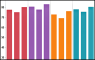
The report marks the first time that CDC statisticians were able to overcome data quality issues to produce reliable life expectancy estimates for Hispanics. The new data cited in the report show that Hispanics born in 2006 are expected to live 2.5 years longer than non-Hispanic whites and 7.7 years longer than non-Hispanic blacks. Hispanics alone are expected to live 2.9 years longer than the life expectancy for all three groups cited in the report.
Use the interactive graph below to compare longevity estimates. Share the data from Table G with others or create your own visualization.

The Hispanic Population in the U.S.
The report cites three-year averages from the American Community Survey to estimate that there are more than 45.4 million Hispanics in the United States. Here's a detailed breakdown of the U.S. Hispanic population:
Mexicans: 29.3 million make up 64.5 percent of Hispanic population
Puerto Ricans: 4.12 million make up 9.1 percent of the Hispanic population
Cubans: 1.57 million make up 3.5 percent of the Hispanic population
Dominicans: 1.24 million make up 2.8 percent of the Hispanic population
Spaniards:Over 450,000 make up one percent of the Hispanic population
Central Americans: 3.59 million make up 7.9 percent of the Hispanic population
South Americans: 2.54 million make up 5.6 percent of the Hispanic population
Other Hispanics: 2.57 million make up 5.7 percent of the Hispanic population
(Note: Other Hispanics include people who did not provide a country of origin.)
Hispanics make up more than 15 percent of the total U.S. population and are now the largest ethnic minority group in the country, according to the report. By comparison, non-Hispanic whites make up nearly 66 percent and non-Hispanic blacks make up just over 12 percent.
About the CDC Report
Prior to the report, data quality problems prevented the production of reliable U.S. life tables for this population, the CDC said. Two issues were cited:
- The race and Hispanic origin was not always classified correctly on U.S. death certificates. This led to the underestimation of death rates for the Hispanic population.
- The age at the oldest ages was misstated in both vital statistics and census data, leading to inaccurate estimates of mortality at the oldest ages.
Read the full CDC report: United States Life Tables by Hispanic Origin (PDF)
Download data from Table G of the report: http://bit.ly/HispanicLifeTables2006
Learn More About Aging
Visit the State of the USA's aging section to learn more about the issues facing older Americans.

How Are Older Americans Faring?
Net-worth disparities among races and education levels, more older women in the labor force and a growing veteran population are among the highlights of a new government report on indicators of aging in the U.S. Explore the report: "Older Americans 2010: Key Indicators of Well-Being" using an interactive reader.
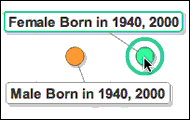
Gender, Population Shifts by Generation
How have percentages of men vs. women in a given generation changed over time? And what unique factors might be in play from one 20th century generation to the next? Track the trends over time using an interactive motion chart.
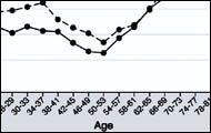
Does Happiness Come With Age?
Yes -- age 50 to be exact -- according to a report published in the Proceedings of the National Academy of Sciences. Read highlights from the report and see what the study's authors have to say.
What Do You Think?
Share your thoughts in the comments section below or weigh in on Facebook or Twitter.
Data visualization by Anthony Calabrese, a State of the USA Web producer.